With the cost of living being at an all-time high, it’s never been more important to keep an eye on your spending. But do you know that shops use psychological tricks to encourage you to spend more?
From well-placed smells that trigger impulse spending, to controls on how we navigate a shop, we’re constantly being encouraged to part with more of our cash.
Supermarket psychological tricks to make you spend up to 40% more

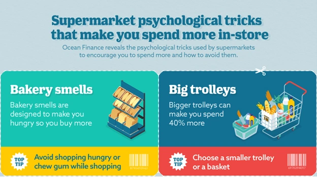
1. Baked goods are made in store, in an effort to make you hungry
When you walk into a supermarket, what’s the first thing you smell? In many, it’ll probably be something baking - bread, something sweet or maybe a rotisserie chicken. Yes, there’ll likely be a place to buy these items, but the smell of food may serve another purpose.
Fresh food made in-store may serve to make you hungry, and according to Juha Öörni in his book “Grocery Shopping Guide”, being hungry in a supermarket can make you spend more. What’s more, the extra items we hungrily add to our baskets aren’t limited to food.
How to avoid it: Chewing gum can detract from the smells in shops designed to affect your hunger. You should try to avoid food shopping (especially your main weekly shop) when hungry.
2. Bigger trolleys can make you spend up to 40% more
According to Bruce Dybvad, CEO of Interbrand Design Forum, shoppers will spend 40% more if they have a bigger trolley, and the same applies to a basket.
For convenience, you might opt to take a large trolley rather than carrying a basket. It doesn’t even seem like a conscious decision, but it could mean you end up spending more on your shop. The more space you have in your trolley, the more likely you’ll fill it.
How to avoid it: Find a basket or choose a smaller trolley. This leaves less room and means you’re less likely to pick up unnecessary goods that aren’t on your list.
3. Placing fruit and veg at the entrance makes you more inclined to spend more money on treats
Supermarkets typically put the fruit and vegetables, as well as flowers, at the front of the shop. But wouldn’t it be more logical to place these often delicate and perishable items towards the back or end of the shop?
There are two key reasons why they do it:
- If you pick up healthy food at the start of your shop, you’ll be more inclined to treat yourself whilst wandering around thanks to implicit priming - a psychological theory that you will remember your previous good decision and reward yourself later in the shop.
- People are attracted to bright colours when shopping, which is thought to enhance one’s mood. People in a happier mood are more likely to spend more, which is perfect when you’re in a supermarket.
How to avoid the trick: Make a shopping list based on the layout of the supermarket, from what you remember, and try not to deviate from the list or the layout to ensure you only buy what you need. This will also ensure you don’t fall for the brightly labelled offers in the aisles, which could encourage you to spend more.
4. Dazzling loyalty card prices encourage spending
It seems that every supermarket has a loyalty card. From Tesco’s Clubcard to Sainsbury's Nectar Card, you get ‘exclusive’ offers by signing up. They give you seemingly phenomenal deals, showing you the normal price and your “special” price. But how much do you save with one?
The special price convinces shoppers to make purchases they may have been on the fence about, as the deals seem too good to be true. But in reality, loyalty prices are sometimes pretty close to what they are in other shops.
How to avoid it: Try not to buy anything you don’t need. If an offer looks too good to pass up, Google the price of the item in other shops to see how much you’d save.
5. Eye-level products have the highest markup
Eye-level products (around 1.2m to 1.5m high) receive around 35% more attention than other shelves. It’s the perfect place for supermarkets to advertise the products with the highest markups.
Think about a supermarket shelf. The branded products tend to be placed front and centre, with own-brand or budget-priced products occupying the top, back and bottom. But when we’re in a rush, how many of us don’t take the time to look around for the best deals and pick up the first thing we see?
How to avoid it: Look around for the best deals on lower shelves especially. Most own-brand products are around 75% to 80% cheaper than regular branded items, so there are some huge savings to be had by looking around.
6. Toys with bright packaging on lower shelves are used to attract children
It’s not just the adults that are being tricked in supermarkets. The touch level (around 0.9m to 1.2m high) is ideal for putting products designed to catch the eyes of children. Think of the touch level as middle shelves as you face them. You don’t have to bend down to reach them, making the products on the shelves easier to see and pop into your trolley.
Products like sweets, magazines or odd toys with brightly coloured packaging and happy characters aimed at children are stocked at the touch level. A child who spots such an item may ask for it repeatedly until it ends up in the trolley. This is known as “pester power” – and parents may be inclined to give in to such demands for a less painful shopping experience.
How to avoid it: Distract your child by letting them take in a toy for entertainment. Have rules in place about what you will and will not buy when you’re out shopping.
7. Everyday essentials can be moved around so you are more likely to explore the store looking for them
When you’re in a supermarket, there’s often one thing on your list that you struggle to find. This may be an everyday item, albeit a more expensive one.
These kinds of products are sometimes hidden to encourage you to walk around the shop so that you’re more likely to pick up unnecessary items along the way. Food tends to be relocated every few months, so even if you think you’ve mastered your local supermarket, chances are it won’t last forever.
Not only are everyday essentials hidden around the shop, but more expensive products are placed in better positions for you to reach. This works in the same way, getting shoppers to walk down each aisle, and thereby increasing the chance they’ll pick up extra items.
How to avoid it: If you can’t find something you’re looking for quickly, simply ask a staff member for assistance.
8. Budget food packaging is made to look cheap
According to Caltex Plastics, 72% of customers are influenced by packaging.
Asda recently made the news for “shaming” customers with their bright yellow budget-line packaging. Whichever side of the argument you sit on, packaging is used to persuade shoppers to spend more.
Despite there being little in quality between budget and premium food in supermarkets, budget lines are put in unappealing, basic packaging. Mid-range and premium food products are made to look more attractive to attract shoppers. This is to encourage buying products with a higher markup because you think budget lines are lower quality.
How to avoid it: Don’t be afraid of picking up budget food - you’re likely getting a very similar product. If you’re unsure, check out the ingredients and compare them with the higher ranges.
9. The design of the floor can make you slow down and, therefore, shop more
A study by the Rotterdam School of Management, Erasmus University (RSM) found that supermarkets can control the speed we walk through stores simply by putting lines on the shop floor. If lines are close together it can make shoppers slow their walking speed.
This trick can be used in places where expensive items are sold, such as alcohol or electronics. If you’re walking more slowly, you’re more likely to notice deals on items you don’t need.
How to avoid it: Focus on your shopping list, not what deals are available.
10. One-way entrances discourage you from leaving
In many supermarkets, you’ll find one-way entrances and exits, either with swing gates or entirely separate doors. This is designed to let you in quickly but discourage you from leaving without shopping.
Dr Paul Harrison from Deakin University says closed entrances put you off exiting a shop before buying something as you’ve already entered a relationship with the supermarket.
You’re also dissuaded from leaving, as you have to cut the queues at the tills to get out, which can be another awkward and off-putting situation.
How to avoid it: If you go to a supermarket but change your mind, don’t feel obliged to buy something just so you can leave.
Shopping advice from the psychologist and managing director of Psychreg
We spoke to Dennis Relojo-Howell, the managing director of psychology website Psychreg, who provided advice on how shoppers can save money.
Dennis said: “The human brain is wired to think as little as possible and respond to short-term problems. Going with the flow saves us energy, especially with shopping.”
He continued that we can “use psychological principles to save money”. If you convince your mind to be happy when you “meet long-term financial goals” like saving money rather than succumbing to impulse buying, you will save yourself money when shopping.
Online psychological tricks to encourage spending
With 93% of Brits now shopping online, encouraging people to spend more using psychological tactics is becoming common practice for e-commerce brands. Find out ten tricks online shops could be using – and how you can avoid them.

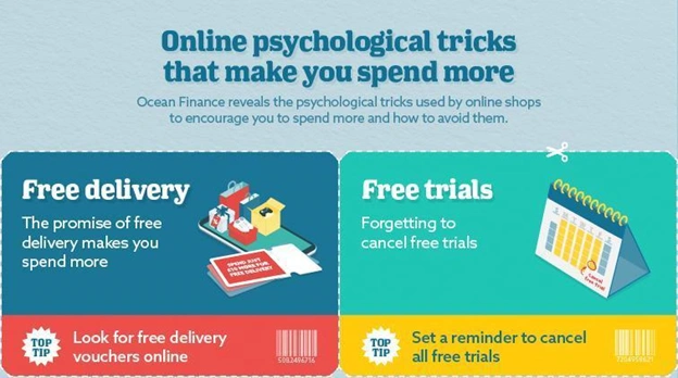
1. Encouraging you to spend more money for free delivery
Ahh, the typical “spend just £X more for free delivery”. Let’s be honest, us Brits can be tight at times and will do anything to get out of paying that delivery fee. But doing so can end up costing us more.
To qualify for free delivery, customers may add something to their basket they weren’t planning on buying and don’t actually need. This will push up the overall cost. It may even work out more expensive than had the customer simply paid the delivery fee.
How to avoid it: Look for free delivery vouchers online. If you do buy something you don’t want so you can get free delivery, use it as a gift or sell it online to get your money back.
2. Sharing sign-up offers for free trials (which we inevitably forget to cancel)
Free trials and offers where you just pay for delivery on your first items are becoming increasingly more common. We’ve all seen the adverts: receive that first box of health snacks for free or get access to trending TV shows and films for 30 days before you start paying for the service.
But these services rely on you forgetting to cancel your automatic subscription, potentially leaving you with a rolling monthly cost for something you didn’t want. If that sounds like you, don’t worry, you’re not alone - 47% of Brits have forgotten to cancel a free trial.
How to avoid it: Set a reminder in your calendar to cancel a free trial. Try to remember to cancel it as soon as whatever you’ve ordered has been delivered.
3. Low-stock warning convinces people to make quick purchases
Many websites add in low-stock warnings like “only five left” or “10 sold this week”. This is a psychological marketing trick used to boost sales by making customers think they don’t have long left before missing out.
While in some cases this may be true, the purpose is to get you to make a decision and buy something you’re on the fence about. It makes you worry they’ll be out of stock, or you’ll miss out on a special price.
How to avoid it: Keep in mind that what you buy should be based on how much you need it, not how much there is left. Take your time making up your mind and decide to buy something when it’s right for you.
4. Encouraging you to buy old stock by promoting a discount for a limited period
Sales are the perfect time for online shops to trick you into spending more. Black Friday, Cyber Monday and Boxing Day are set up to prompt more spending.
Retailers use countdown clocks to create a sense of urgency. They also dazzle customers with lines like “up to X% off” to imply higher savings than you actually get.
Some retailers use it as an opportunity to sell off older stock, confusing customers who think they’re getting the latest products.
Which? found that 98% of deals on Black Friday were either the same price or cheaper in the following six months, so don’t panic buy something that you could get for less in the future.
How to avoid it: Don’t just buy something because it’s in a sale. Think about whether you actually want it and check the price on other websites instead of panic buying.
5. The left-digit effect where pricing items at .99 encourages spending
This typical shopping tactic has been commonplace for many years but is becoming even more popular online. Pricing something at £12.99 instead of £13 engages the left-digit effect. This anchors your brain to the “9”, making you think the price is cheaper than it is.
The more expensive an item is, the more effective this is. If you’re buying a TV, £299 is a lot more appealing than £300.
Another similar trick is removing the comma from bigger numbers. To many people, “£6000” looks lower than “£6,000”, so watch out for the missing commas.
How to avoid it: Stop and think about the actual price of an item rather than the implied price. £500 and £499 are essentially the same, so don’t get blindsided by fake value for money.
6. Offering shopping discounts to sign up to emails
An increasingly common marketing ploy is getting customers' email addresses in exchange for a discount. While you get an introductory offer, this lets the company have your details for further marketing down the line.
While the introductory offer might be worthwhile initially, customers will likely be contacted about products they otherwise wouldn’t have bought, tricking them into spending more.
Another common tactic for some brands is to guilt customers into signing up by using passive-aggressive language such as “No thanks, I don’t like saving money”.
How to avoid it: If you don’t want to receive marketing emails, unsubscribe once you’ve used your discount code to avoid being tempted.
7. Making you install their shopping app to get a discount
Another way to get your data for marketing is by encouraging you to download an app to make a purchase. This will usually result in a discount on your first purchase.
Not only does it encourage you to spend more when you use the app, but it also gives away your details for future marketing, especially if you allow in-app tracking and push notifications.
How to avoid it: If you do download an app for a discount, check the settings permissions and make sure you’re not allowing them to track you. Delete the app and remove the data from your device after you use it.
8. Advertising associated products you don’t actually need
If you’re looking for the perfect pair of jeans, what's an associated item that you might buy at the same time? Maybe a belt or some shoes? Rather than trying to sell two products separately, online retailers could lump two items together.
Say the jeans are £50 and the belt is £15 separately, a retailer could put them together and offer them for £65, meaning they sell a belt with every pair of jeans. You think you’re getting a great deal and something that will benefit you, but you’re buying something you weren’t going to and it is still full price.
How to avoid it: Stick to what you initially wanted and ignore the associated items - even if it appears to be a great offer.
9. Hooking you with an abandoned shopping basket email
If you have an account with a particular brand or website and add a product to your basket or a wishlist but leave it before buying, they might send email discount codes to encourage you to make that purchase. This encourages you to spend more money than intended by making the price more appealing.
A discount also makes it more likely that you’ll buy other products, potentially spending more than you would in the first place.
How to avoid it: Rather than avoid this one, use it to your advantage. You could make an account and leave something in your basket to see if they send you a discount code.
10. Avoid dark patterns such as hidden fees at all costs
Dark patterns, also known as deceptive design patterns, are when websites are designed to hide information from customers. This is done to influence customers into making decisions they wouldn’t normally make. It could be paying too much for a product or service or unwittingly subscribing to emails.
The most common are hidden checkboxes subscribing you to a service or fee with obscure names such as “additional fees” or “tax”. In reality, these can be voluntary fees that might not need to be paid.
If you do find one, you can submit it to the Dark Patterns Tip Line to help out other customers and stop them from being ripped off.
How to avoid it: Look carefully for any hidden fees. Make sure you check what you’re subscribing to.
UX researcher who specialises in making you spend more reveals her insight
We spoke to Hayley Fothergill, a UX researcher who specialises in online shopping. Her job is to discover customer behaviours, needs and motivations to make products and websites more appealing, which can encourage customers to spend more.
She said: “Lots of online retailers use techniques grounded in consumer psychology to influence the behaviour of their website visitors – for the simple fact that they tend to work."
“It’s easy for us to be oblivious to these tactics, as most of the time when we are browsing online (or making any kind of decision), we tend to be ruled by the more impulsive side of our brain, rather than the more rational and logical side – which explains why so many of us make regret purchases."
“These simple tips and changes in habits, even like sleeping on a decision, can help us make more considered decisions rather than being swayed by the psychological cues websites use.”
Retail shops & shopping centre psychological tricks to encourage you to spend more
Up next, we have shopping centres and their many retail outlets. Since the emergence of American-style shopping centres, we’ve been encouraged to spend more money using subtle psychological tricks.

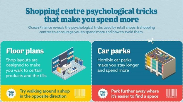
1. The layouts of clothes shops encourage you to see as many products as possible, making you more likely to spend
Clothes shops use different layouts to maximise browsing, getting you to look at, touch, and try on as many items as possible.
Shopping displays are set out in a grid, racetrack, freeflow or herringbone layout to get you to navigate through as many items as possible before ending up at the tills.
- Grid: maximising product space and pushing you down aisles and into corners, where you’ll find key products.
- Racetrack: designed to get you to walk around a shop, directing you towards key items.
- Herringbone: pushing you down a central row with key products on the end of aisles.
- Freeflow: freeflow is a little more flexible but still pushes you towards key products, with the tills beside the door.
How to avoid it: Always remember to stick to a list of what you need. So, as you move through the shop, you won’t fall for any unnecessary products.
2. Making you more likely to impulse buy through ‘scripted disorientation’
If you’ve ever wandered through a department store, or the likes of Ikea, and thought ‘I have no idea where I am anymore, or how to get out’, you are not alone. In fact, if you’ve ever been in that situation, you’ve probably bought more than you intended due to walking in areas you might not have needed or wanted to go. This is a technique called scripted disorientation.
It is used by architects – who will consider every detail of a shopping centre - to encourage you to impulse buy as you become disoriented and ‘forget’ what you originally came in for.
How to avoid it: It is difficult to avoid this as the store’s (or shopping centre’s) layout has been set in such a way to encourage you to pass as many items as possible. But, with such large stores, there are directions to find out exactly where you need to go. For instance, follow the arrows on the floors in Ikea stores to avoid stopping in areas you didn’t intend, or speak to people working in the store to direct you to specific sections.
3. Multi-storey parking can make you shop longer
Have you noticed that most parking spaces in shopping centres and even cities are in multi-storeys? They can be hard to enter and difficult to park in, but multi-storey parking makes sense to get in as many people as possible. However, they could serve another purpose.
If you associate driving your car with a negative experience, you’re more likely to stay shopping for longer. Whether that’s to wait for car parks to be quieter or just putting off leaving, the more time you spend there, the more you’ll spend money. In addition, they tend to offer longer stays so you will likely use that time to spend more time shopping.
How to avoid it: Park further away. It’ll be a longer walk but you will likely aim to return much quicker if you don’t have a long stay option, and it’s easier to leave.
4. Shopping centres engage all the senses to make you shop more
The Gruen Transfer or Gruen Effect is a theory by architect Victor Gruen who designed early shopping centres. He said that if you are overwhelmed when entering a shop (due to bright colours, eye-catching products, shopping deals and delicious smells, for example), you could fall into a state of confusion, making you more subjective to advertising and persuasion.
So, according to this theory, if a shopping centre is bright and loud, with different smells and a lot going on, you’re more likely to wander around shops. This means you may end up in shops you might not have thought about going in, spending more than you planned.
How to avoid it: Plan which shops you want to visit beforehand and avoid aimlessly wandering when shopping.
5. A lack of windows in a shopping centre can make you spend more time there
Shopping centres tend to have limited natural lighting thanks to tinted windows and, occasionally, no windows at all.
Along with the right ambient lighting and music, you could be so relaxed as to lose track of how long you’ve been shopping. It gives a suspended time effect, encouraging you to shop for longer.
How to avoid it: Give yourself a target time you want to leave and stick to your schedule.
6. Displaying products in a way that makes you fall for the 'compromise effect'
A key trick used to get you to shell out more for something expensive is the Compromise Effect. This tactic makes a product appear cheaper in comparison to an expensive one.
The method involves placing an expensive item next to a mid-range item with a high markup. Customers will see the price of both items and likely choose the lower-priced one.
You think you’re saving money and making the sensible choice, but in reality, you’ve bought the product the shop may have wanted you to buy which doesn’t necessarily mean you have saved.
How to avoid it: Check the prices of items you find online to make sure you’re getting decent value for money.
7. Encouraging you to spend by making your day an ‘experience’
If you’ve ever been to a shopping centre, you will notice the sheer number of food outlets and restaurants. You might not have gone into the shopping centre hungry or prepared to eat, but we can guarantee that many of you have decided to pop into a restaurant after seeing a spot you fancy. And vice versa.
You might have gone to the shopping centre to eat at a specific restaurant and walked out with bags from stores you had to pass on the way. This is because shopping centres attempt to make your day an experience and a place for you to spend a number of hours, rather than just dart in for one thing.
The same goes for places like cinemas or bowling alleys in shopping centres. You’ll likely have to walk by popular shops before reaching them.
How to avoid it: If you’re just going for food, try not to venture into any shops for an unplanned visit and know exactly where the restaurant is before visiting (check out the shopping centre’s map online). Or, if you are going shopping, try not to shop hungry as you could spend more than you planned.
8. Shopping centres are designed to make you linger for longer with music and lighting techniques to relax you
A calm shopping environment is a perfect way to get people to stay longer and spend more money. Shopping centres do this with calming music with a low BPM, soft lighting and warm colours.
According to Allison Tait in Credit Card Stressbusters, the more relaxed you are, the more open you are to spending money.
Another example is shop queues - more people are likely to leave a stressful shop with a long queue if they only have one or two items. If you’re more relaxed, you’re more likely to wait.
How to avoid it: While a relaxed shopping experience is universally desired, if you are looking to spend less, try to pop into only the shops that you need to visit or are interested in.
9. Looking for shopping centre maps can make you wander around shops you might not have seen
Shopping centres can be big and confusing places, and some shops can be difficult to find.
Often, you may spend time looking for a map of the centre, which leads you to shops you might not have looked at, potentially encouraging you to spend more than intended. You may even go looking for a customer service desk, which could be placed in the middle of the shopping centre, requiring you to walk past more shops for assistance.
How to avoid it: Looking for somewhere specific? Look it up on your phone if you can’t find a map. Alternatively, ask someone who works there to point you in the right direction.
10. Manipulative window displays catch your attention.
A key tactic to get you into a shop is window merchandising. Typically, this is done by showing off popular products in the most aesthetically pleasing way.
Depending on the type of shop, prices will either be out on display to highlight how cheap items are, or premium shops will make it much harder to see at a glance, motivating you to go in.
Another way window displays are used is by adding huge red sale signs or mannequins with sales shirts. This encourages a sense of urgency, especially if signs include “limited time” and similar lines.
How to avoid it: Don’t fall for everyday sales. They are a great way to encourage spending on sale products but also on normal goods, so avoid the full price if you are just looking at sale items.
Read on for our tips on how to save more than £300 a year on online shopping.

